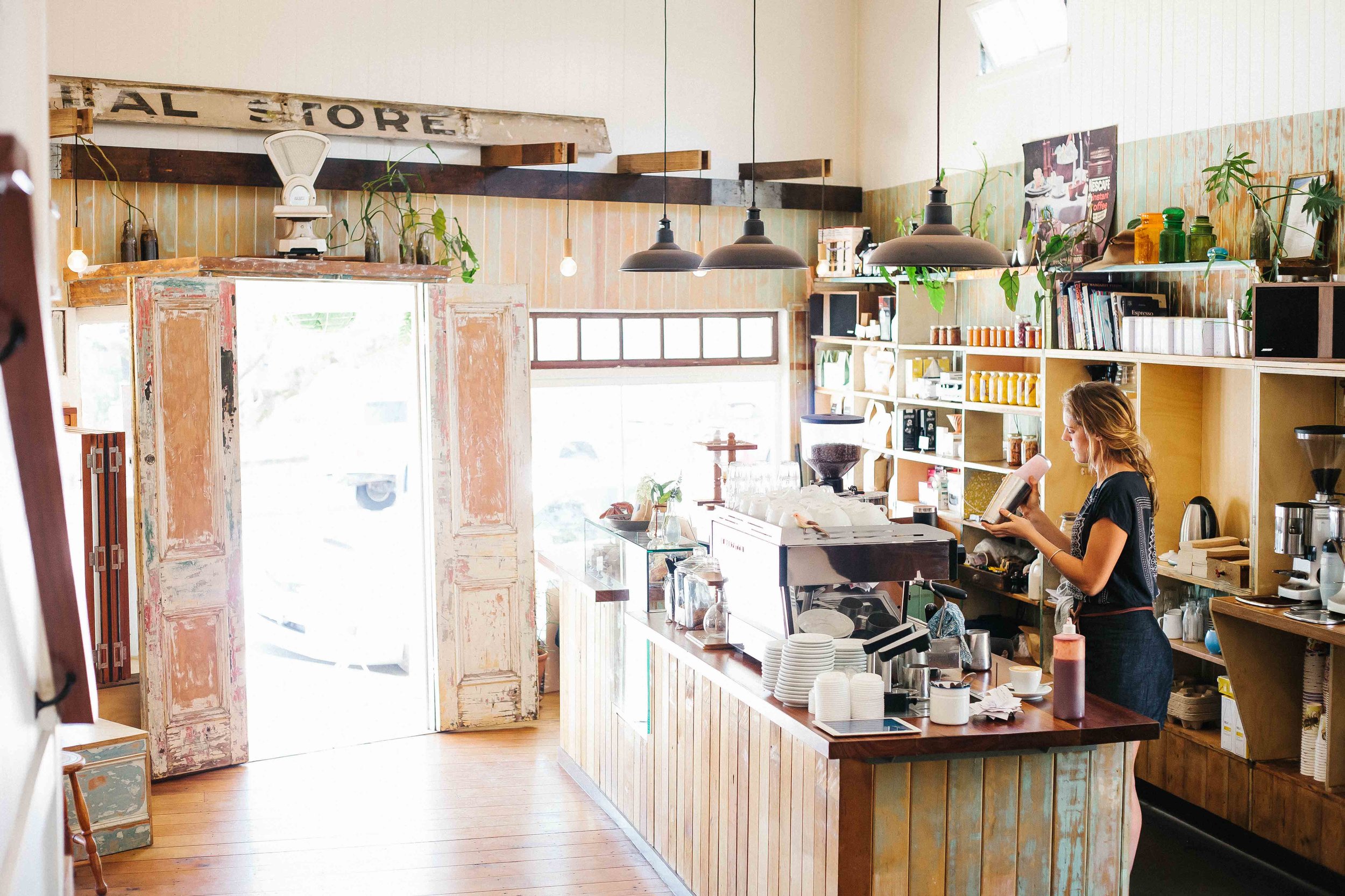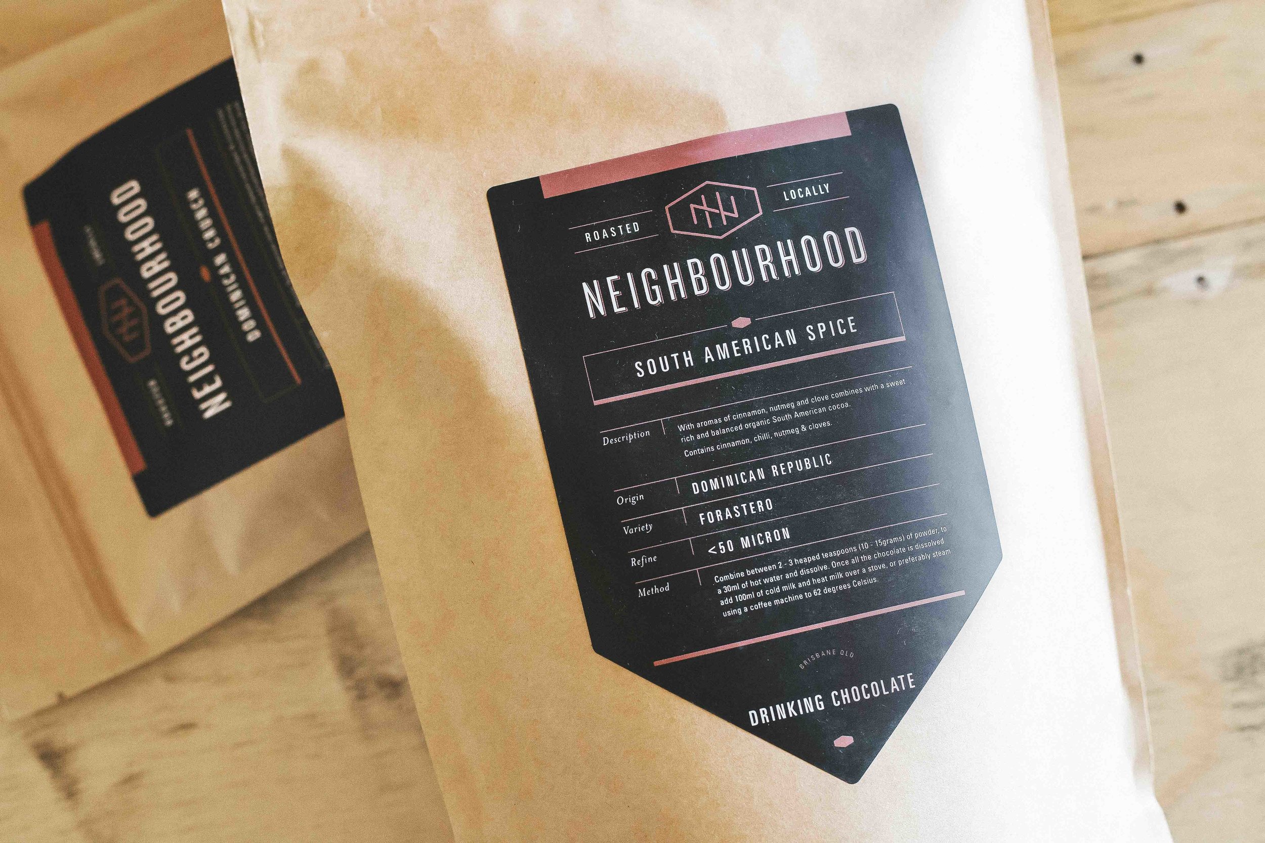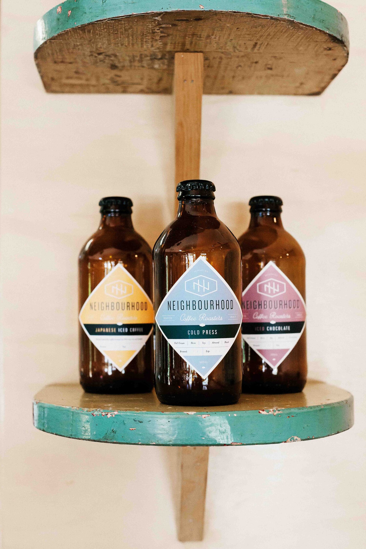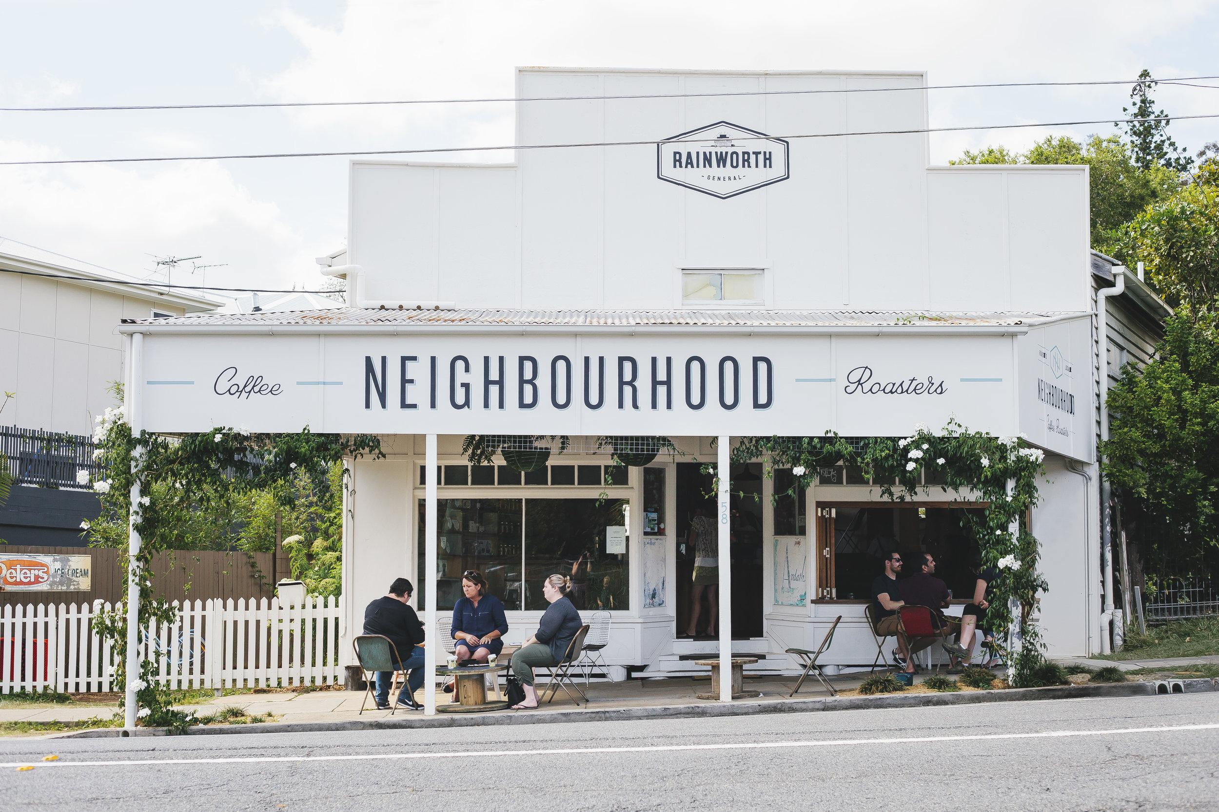
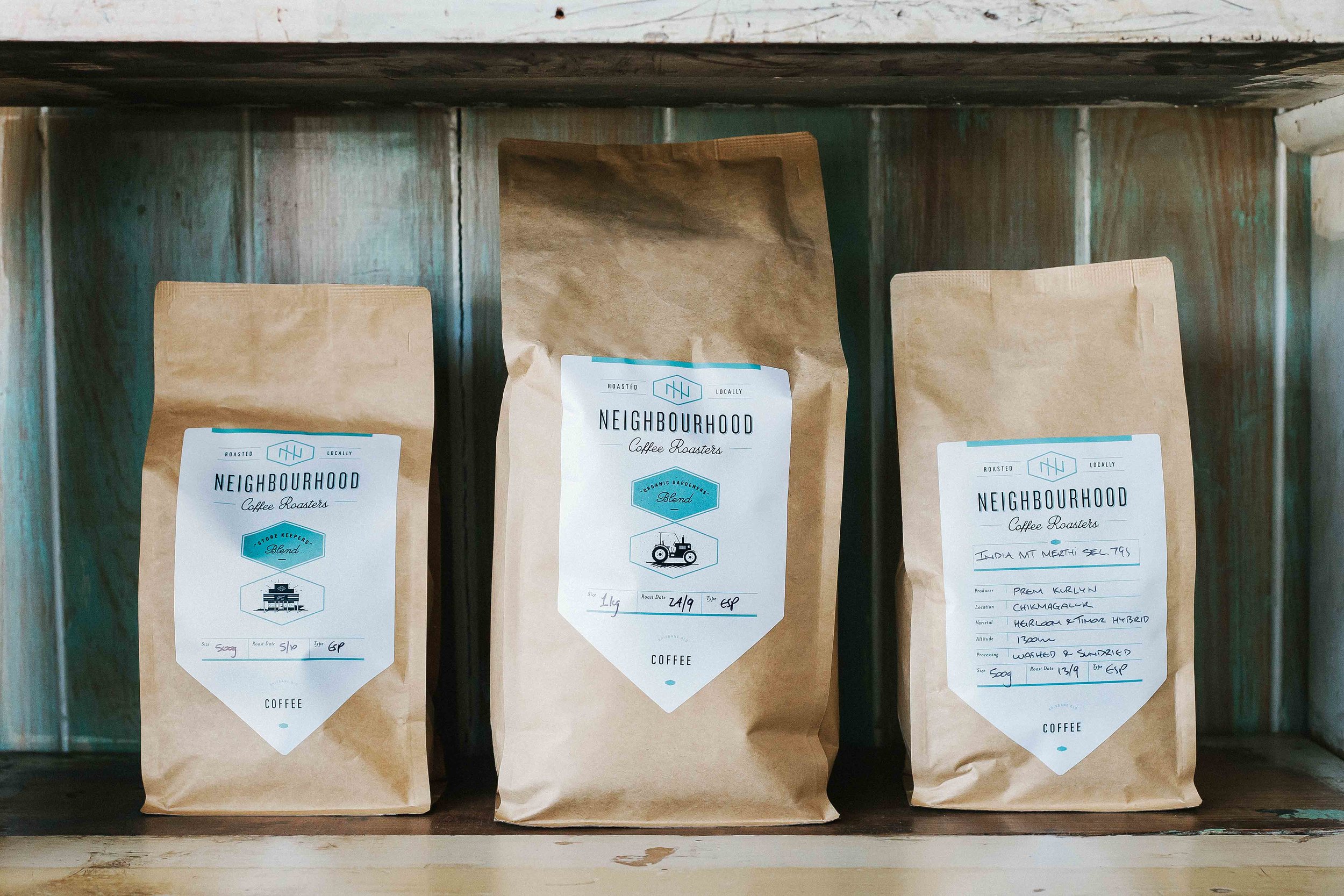
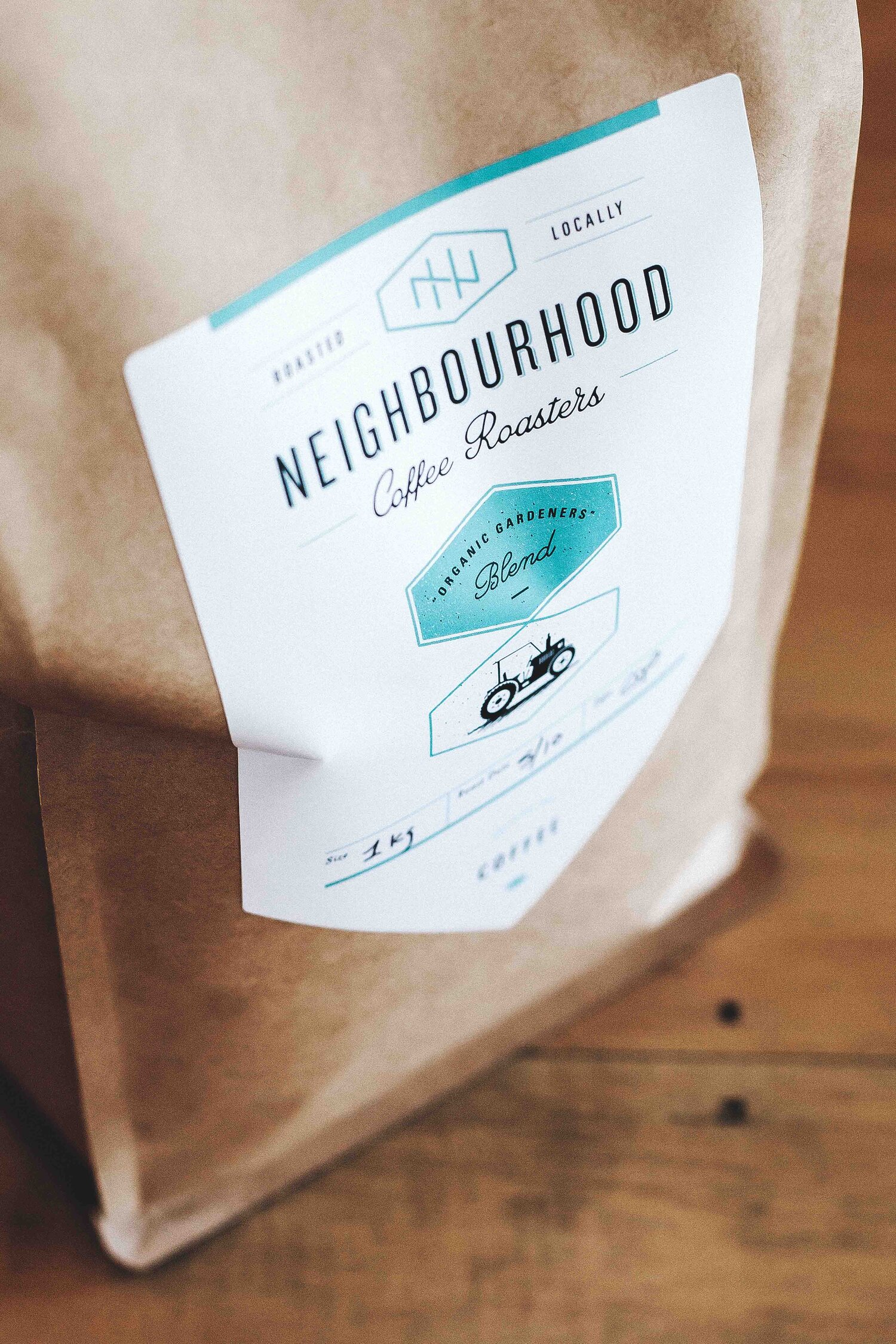
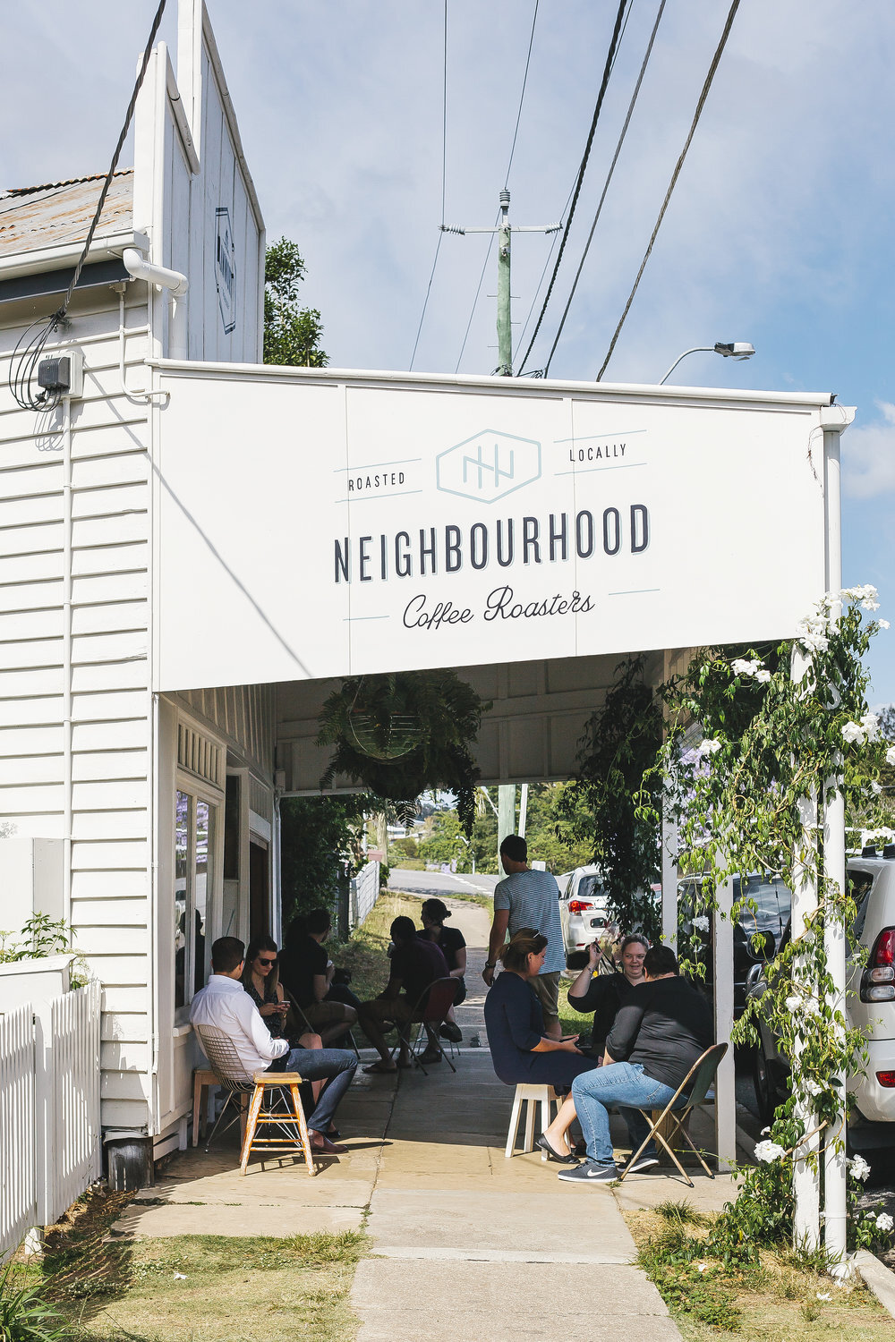
The Neighbourhood Coffee Roasters brand approach was to capture the essence of what the 'local general store' in the 60's would have been like, but executed in a contemporary context. The outcome was a simplistic and welcoming brand that centres around a monogram icon.


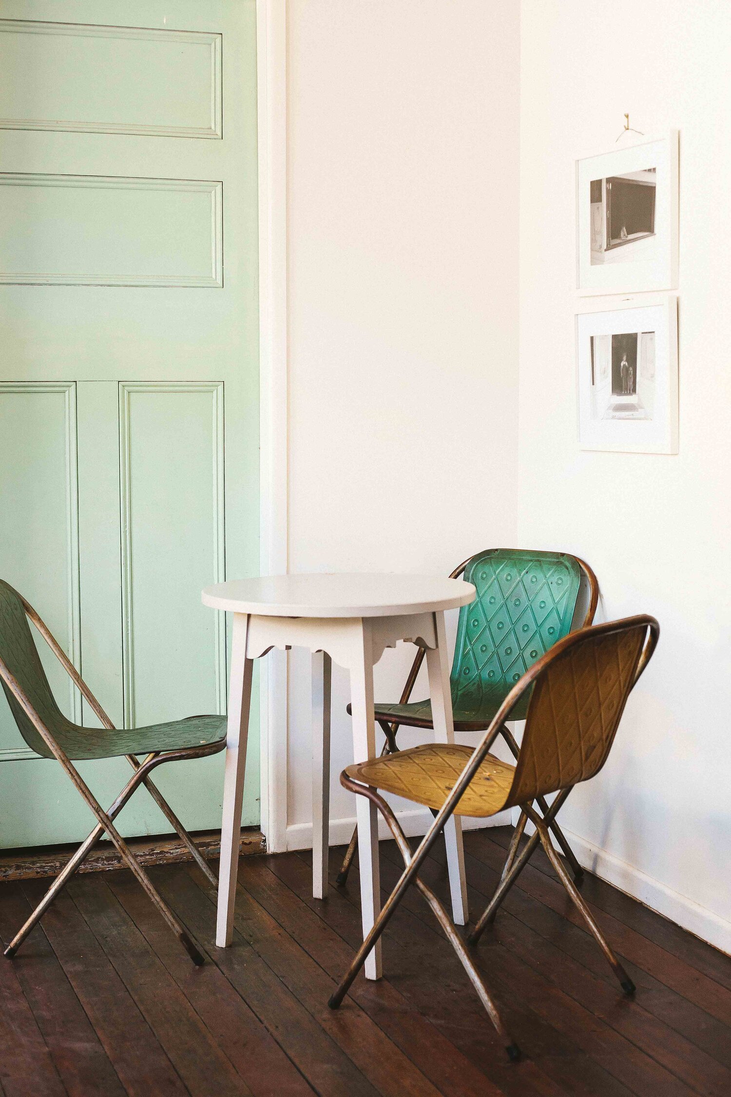
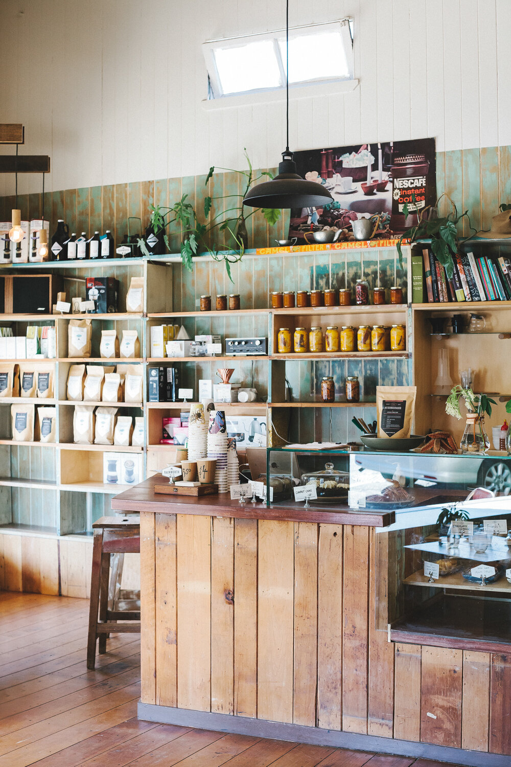
There was a real sense of workmanship and sturdiness in the details of the old shop — where things were put together in a very functional and practical manner; a real hands-on, do-it-yourself mentality which was an inspiration for the creative process.


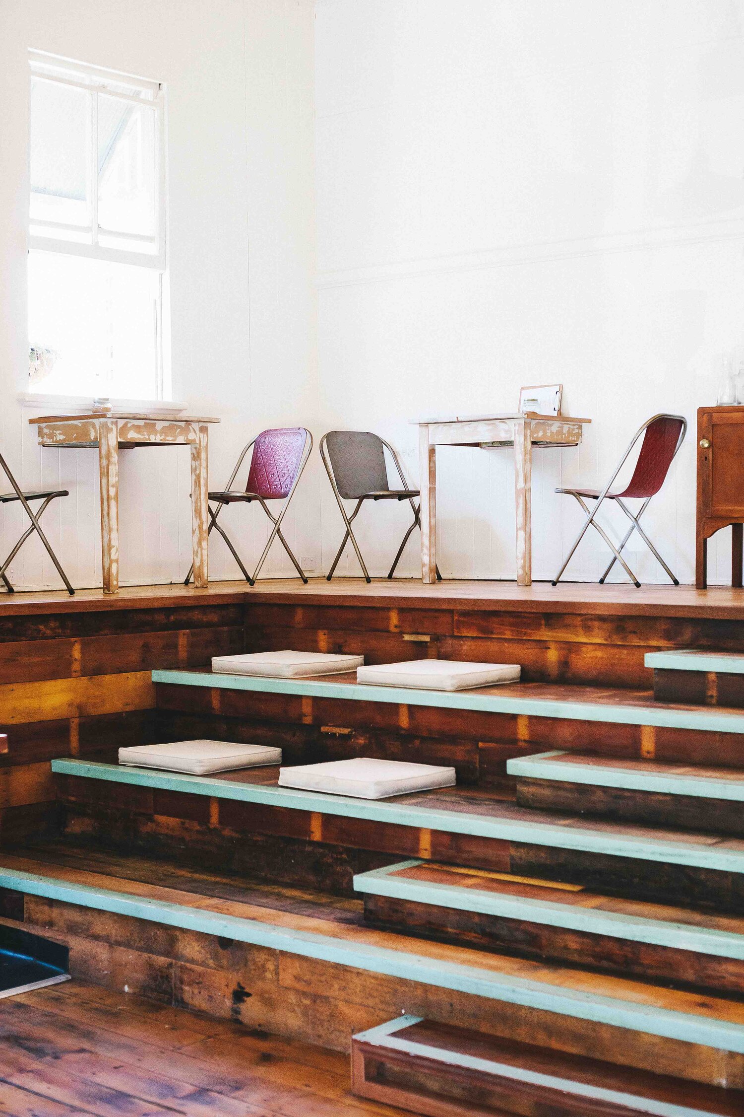
The original colour scheme was revealed when layers of paint were peeled back - and these form the basis for the brand and interior colour palette.